Most of us have seen these mind-blowing online coaching websites with modern designs and beautiful buttons, making you trust the coach and purchase the service. Well, YOU can have that too.
Let’s now dig deeper into the coaching website examples for every niche.
The following article covers:
Life Coaching Websites
Here is a list of 7 life coaching websites you can look up to.

1. Your Kick-Ass Life
Being a life coach is not an easy task. However, committed coaches become successful. Your Kick-Ass Life is a website owned by an amazing and strong woman - Andrea Owen. She is a professional certified life coach and successful author.
Key takeaways:
- She made clear what she does (books, podcasts, coaching), so when creating your website, make sure to be clear and avoid confusion.
- She has separate pages for different activities (books, podcasts, coaching, etc.), which is good for creating memorable and pleasant user experiences.
Make sure you pay attention to these aspects.

2. Mel Robbins Take Control of Your Life
Mel Robbins is a famous lifestyle motivational speaker. She is a public speaker rather than a coach who trains people one on one or gives direct feedback to individuals. Her website is dynamic and Interactive. Even people who are not familiar with her can quickly get a clear idea of what she is doing just by skimming through her website.
Key takeaways:
- Interactive and dynamic features catch users' attention.
- Simple words - powerful meaning: the website content includes powerful words but is still highly readable and recognizable by a wide range of audiences.
- Value others' time: skimming is enough to get an idea of what she is, what she does, and why to choose her.
3.Rich Litvin
Rich Litvin is not only a famous life coach but also the author of the best-seller book “The Prosperous Coach.” Just as you visit his website, you get a clear idea of the type of clients he works with and what he offers. You do not need to navigate to the “About” page to gain valuable insights about him. His main message is clearly presented on the homepage.

Key takeaways:
- You do not have to build a long scrolling homepage. Your concise message can be presented on a short page too.
- Carefully chosen website colors correspond to the brand message and the main picture colors.
- About page. The information about him includes specific numbers, which in its turn promises specific outcomes.
So, ensure you are not beating around the bush. Instead, present the information in a concise and specific way.
4. Marie Forleo
Marie Forleo is best known for her weekly show MarieTV. She is also the founder of the business school B-school and an inspiration for many women around the globe. The video content she creates is harmoniously included in the website. Her pictures and videos are full of life, which makes the visitor instantly engage with the website.
Key takeaways:
- Content repurposing. If you also are a video creator like Marie, ensure to use your video content for blogs and other parts of the website.
- Create a clear message and visual representation of everything you do & offer so that the user is not confused about who you are.
- Include success stories & testimonials of your customers on your website.
So, do not lose the chance to present everything you do on your website in a helpful and multi-purpose manner.

5. Shinebright
Shinebright was founded by two friends, Meike & Shannon. As you visit the website, you see the coaches’ main goal clearly formulated at the top of the homepage. The banner and colors they chose work hand in hand with the brand name. As more and more people prefer watching the video over reading a text, they created a short introductory video. Within 2 minutes, Shannon & Meike introduce themselves in such a way that helps them gain trust and credibility.
Key takeaways:
- The eye-catching CTA button. Who would not like a free consultation? The coaches and their team used this winning opportunity.
- Clarity. They present not only services but give specific outcomes for those services.
- One of the landing pages includes information about who the service is suitable for and whom the service will not fit.
So, you should also stay specific to save your and the client’s time.
6. I speak life
Happiness & satisfaction are one of the most desired outcomes for life coaching. And what do you see when you first visit I speak life? Yes, you see David standing there and laughing. He is a life, executive, and anger coach. He instantly manages to create a picture of a positively-driven and friendly coach. How you present yourself and your brand plays a huge role in how the customer interacts with the website.
The slider of huge companies David has worked with adds to his credibility.
Key takeaways:
- As you scroll down, you constantly see the call-to-action button in the same place. It is specific, telling, compelling and action-oriented.
- Makes a nice first impression & builds a positive brand image.
- The best client stories are represented in video format.
So, make sure your visual elements and texts communicate emotions and correspond to your brand message.
7. Ella Clark
Ella Clark helps her clients achieve a life balance in terms of well-being and self-confidence. The motto she chose to represent her aim is nicely communicated through her background picture. Many of us, including Ella, associate the color blue with calmness and inspiration.
On her homepage, she further elaborates on the key cornerstones of her coaching philosophy, which helps the visitor build expectations.
Key takeaways:
- She has a special menu category for case studies. Relatable case studies are an excellent way to build trust through storytelling. Besides, they are arranged in sub-categories, which makes the search easier.
- She presents information about her services briefly and uses text formatting, even for a small piece of text.
- Her brand message matches the visuals and fonts.
So, ensure every element you use for branding purposes serves your brand goals equally and the materials included are easy to digest.
Business Coaching Websites
Now, let’s review 5 business coaching websites you can take inspiration from.
1. Samantha Siffring
Samantha Siffring is a professional, experienced business coach and also a mom who teaches millions of moms in the World how to make money.
Her website has a good color choice, and the Focus area is clear. When you visit her website, it is evident that she focuses on moms in business and assists them in establishing and expanding businesses.
Key takeaways:
- Good color choice does not always mean highly contrasting and bright colors.
- If you have a specific niche, ensure it is straightforward for everyone.

2. Studio Grow
A Niche-specific website named Studio Grow focuses on coaching and helping you grow your fitness industry business. This website is successful for a few reasons:
- Typography: using a few different fonts, even some in "Handwriting" style, every piece of text on the website is still easily readable
- Dynamics: The website has dynamic thumbnails and photo galleries
- Free features and services
Key takeaways:
- Adding dynamic thumbnails and photo galleries makes your website more attractive to others.
- If you can offer a few free features, such as free podcasts, e-books, or consultations, call your potential clients to understand better what to expect from you and thus trust you more.

3. Rebecca Liston
When you land on Rebecca Liston’s website, the first thing you will see is an eye-catching header. Her confident and smiling picture indeed grabs attention and makes the visitor explore further.
The choice of words included in the copy makes it simpler and unique. And, as the icing on the cake, the compelling CTA finishes it all.
Key takeaways:
- The realistic visual elements, choice of colors, fonts, and words contribute to a better understanding of the brand message.
- Testimonials and case studies are presented in a unique & clear way.
- She included a fun fact in her about page so that she could make a lasting impression on the website visitor.
So, do not be afraid to think outside the box and show sparks of your personality through the texts and visual elements.
Health Coaching Websites
More examples are coming. Look how these health coaches present their messages on the website.
1. Stop Binge Eating
Let’s have a look at Kristen Sarfde’s website which is dedicated to helping people with overcoming Binge Eating. The first thing that we see on the website is that Sarfde also had the problem of binge eating. That creates an empathetic connection between the coach and the reader.
Key takeaways:
- Use accent colors to attract the attention of readers.
- Put feedback on the main page – you have to show people that your coaching methods work.
So, get personal with your clients. It helps to build trust.
2. Health Coach FX
Health Coach FX is a website developed by Laura and Petra – mother and daughter – who aim to revolutionize female health.
The first thing we notice about this website is the excessive use of the color green. That color is associated with nature and health and is proven to have a calming and comforting effect.
They briefly describe each of their goals and finish it with customer feedback.
Key takeaways:
- Colors, pictures, and content that show a connection to nature give people a sense of safety and trust.
- Put your main goals and results on the main page to make new readers stay with you.
So, showing that your business is built around a family is a good way to gain the reader’s trust.

3. Lisa West
Just as you visit Lisa West’s website, you see calming shades of color white. It creates the relaxing atmosphere yoga-therapist coaches tend to provide. As you scan the website, you can easily understand what she does and how she can help you. She presents the benefits of her services through her own experience. This is where she is able to connect to her target audience successfully.
Key takeaways:
- She clearly presents all steps a client will go through to achieve the goal.
- She mentions what the client can expect and the way she works with her clients.
So, help your potential client understand your message and what you do easily. Help them to build the right expectations.
4. So Fresh N So Green
As she tells about herself, Lauren is a nutrition & health coach, a multitasking mother, and the founder of So Fresh N So Green.
Her interactive website colors & pictures fit her brand message perfectly. The website is strategically structured. Before the main homepage starts, you can see her most recent offer about the online course at the top.
Key takeaways:
- Lauren makes you feel you are not the only one facing the same challenge, which makes people feel understood.
- She offers a quiz so that the visitors can find out themselves whether they need her services.
- She clearly states what she does to help her audience, which is through customized recipes and tips.
So, use every opportunity to resonate with your audience.
5. Live Well With Kristine
Kristine is a fitness instructor, trainer, health and & nutritionist coach, and the founder of Live Well With Kristine. She helps to get the body transformation her clients envision.
She introduces different scenarios where clients will be needing her help and the promised outcomes. Kristine also included client testimonials and certifications she received.
Key takeaways:
- Kristine included all the steps it takes to set a free health strategy session.
- She shares not only tips but also healthy recipes in her blog.
Fitness Coaching Websites
Time to get fit! Look at these inspiring fitness coaching websites we’ve found.
1. Physiqonomics
Physiqonomics is a fitness coaching platform developed by Aadam. Aadam is a fitness coach and writer. He directly works with customers and writes articles to help people in general.
His website is full of witty and humorous paragraphs, yet the design is still simple. Muted background colors, arrows that guide readers, and, of course, customer feedback are the main features of the website.
What can we learn from Aadam?
- Your design does not have to be complicated to be effective.
- Humor and irony can add a bit of spice to your website and attract customers that are tired of reading hundreds of semi-formal articles.
2. Bony and Beastly
Shane, Marco, and Jared – the creators of the website Bony to Beastly – are funny 'skinny dudes' (as they call themselves) that created a 5-part course to help other 'skinny dudes' with 'bulking.' Their course concentrates on weight lifting and nutrition.
Bony to Beastly stands out from other websites, as the color scheme is inverted. The background is black, and the accent colors are vibrant and bright.
Creators first put their main goals, methods, and personal results.
What can we learn from Shane, Marco and Jared?
- Stay unique – you want customers to remember you.
- Be humorous and honest to become trustworthy.

3. Forge Fitness and Nutrition Coaching
Forge Fitness and Nutrition Coaching is founded by Michael S. Parker. He inspires people with the adventures he shares on a separate website. From his website, you can easily tell he is an adventurous online fitness coach and an author. With his team, he offers habit transformation and other programs.
Key takeaways:
- They present a visual world map of countries the clients come from. This helps to build a good rapport and trust with potential clients.
- The client testimonials are presented via nicely edited videos.
- They included the image of a mobile application in the top banner, which already gives an idea about how clients will track results.
So, choose your special approach when it comes to presenting your services.
4. Michael Morelli
Michael Morelli is an in-demand fitness coach and best-selling author who also produces podcasts and runs a youtube channel. You can access his podcasts directly from the website.
Through his heart-touching story, he inspires many people who feel down.
Have you ever felt you were never going to achieve your fitness goals? Michael Morelli proves the opposite with every piece of the website content.
Key takeaways:
- He is honest with his audience and presents things as they are.
- He speaks with clear and specific numbers, which help to establish expectations for each potential client.
So, be genuine in the way you present yourself, and you will see more and more people trust you.
5. Girls Gone Strong
You hear the brand name, you read the main heading, and you see the banner. Who do you think Girls Gone Strong focuses on? Yes, it’s all intended for women.
They dedicated special sections on the homepage for different goals women seek to achieve through fitness coaching.
Key takeaways:
- They tell the visitors who they work with right away.
- They present social proof on the website.
- They offer free courses which serve as lead magnets.
- They prepared quizzes for those who would like to become coaches themselves.
Finance Coaching Websites
1. Money School
Money School is a life coaching website that is arranged by Mark Butler to help consumers with finances. It doesn’t matter whether you are self-employed or have three jobs, the number of zeros on your bank account doesn’t matter either – Mark Butler will find an approach to everyone.
Here are some features of his website that you may find helpful:
- Butler uses soft green with contrasting orange to separate the parts of his website and indicate important information. Contrast helps to create accents, which makes consumers stay engaged.
- Provide proof that your program works, show experience, build trust.
2. Jacquette Timmons
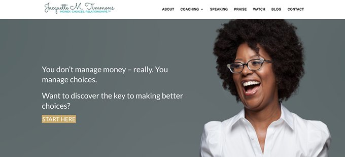
Jacquette M. Timmons is a woman who has a unique approach to money, having education both in finance and design. She uses her coaching website to show people the humane side of money.
Her main page is minimalistic, painted in dark, muted colors with white as the accent color. She put her main objective and articles about her approach below.
What can we learn from Jacquette M. Timmons?
- Embrace individuality to make consumers feel unique.
- Show your experience and reliability.
3. Amy Scott Finacial Coaching
Amy Scott is a certified professional financial coach who empowers women to get rid of their fears and make wise financial choices.
She has a very compelling and bold statement as her heading. The type of language and grawlix Amy uses come to prove she is a person ready to take risks and will preach the same to her clients.
The copy on her website includes the pain points and pleasure points of customers.
Key takeaways:
- Amy showcases the podcasts she has featured in
- She made it easy to schedule a call and book an appointment.
- Money is a sensitive topic. However, Amy creates a sense of being understood through her website content and pictures.
So, try to grab the visitors' attention with something typical to you.
Career Coaching Websites
Still, scrolling? Because our list goes on. See what career coaching website examples we’ve found for you.
1. CareerSequel
Lee is a woman who stopped her career when she had kids to dedicate all her attention to her family. But as her kids grew, she decided to embrace her education and go back to developing her career.
The background of CareerSequel is white. Another design decision is photographs of Lee herself, where she is presented as an open and confident person.
What can we learn from Lee?
- Create a story around yourself, and show viewers that you understand their problems from your personal experience.
- Connect your design with the content and your personality.
2. Happen to Your Career
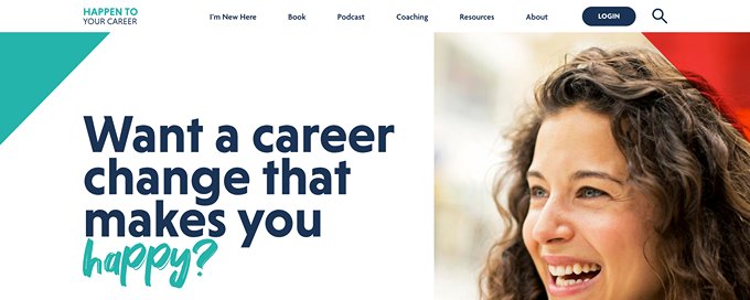
Happen To Your Career is a coaching website that offers a wide variety of content with one aim: help people find their dream careers. There are audio podcasts and articles, as well as individual coaching sessions.
The structure of the main page reflects the goals and results of Happen To Your Career, showing the podcasts and articles.
What can we learn from Happen To Your Career?
- Don’t be afraid to be bold – that will catch the attention of your audience.
- Prove that you have some valuable content and put it on your main page.
3. Mary Blalock
Mary Blalock’s recruitment experience helped her to understand people’s life challenges on a deeper level. This is one of the reasons she was able to help people get jobs at world-famous companies.
The dominating yellow color on the website brings positivity and warmth. Did we mention she offers a free session and includes it in her CTA? Yes, that is one of the website’s winning points.
Key takeaways:
- There is a separate section where she shows how she helps her clients
- She has compelling CTA buttons.
- She is active on social media and links her account and posts to her website.
Dating Coaching Websites
Take a deep breath. We still have dating, leadership, and executive coaching website examples to discuss. Let’s continue with dating coaching.
1. Relationship Hero
Relationship Hero is an online coaching platform dedicated to improving people’s dating life. Creators use an individual approach to their customers, helping them and their partners find happiness and unity.
Relationship Hero allures possible customers by showing ‘stories of success’ – examples of their work done well.
What can we learn from Relationship Hero?
- Be multifunctional, and provide different forms of information.
- Show your team – it makes you look more reliable and trustworthy.
2. Amie Leadingham
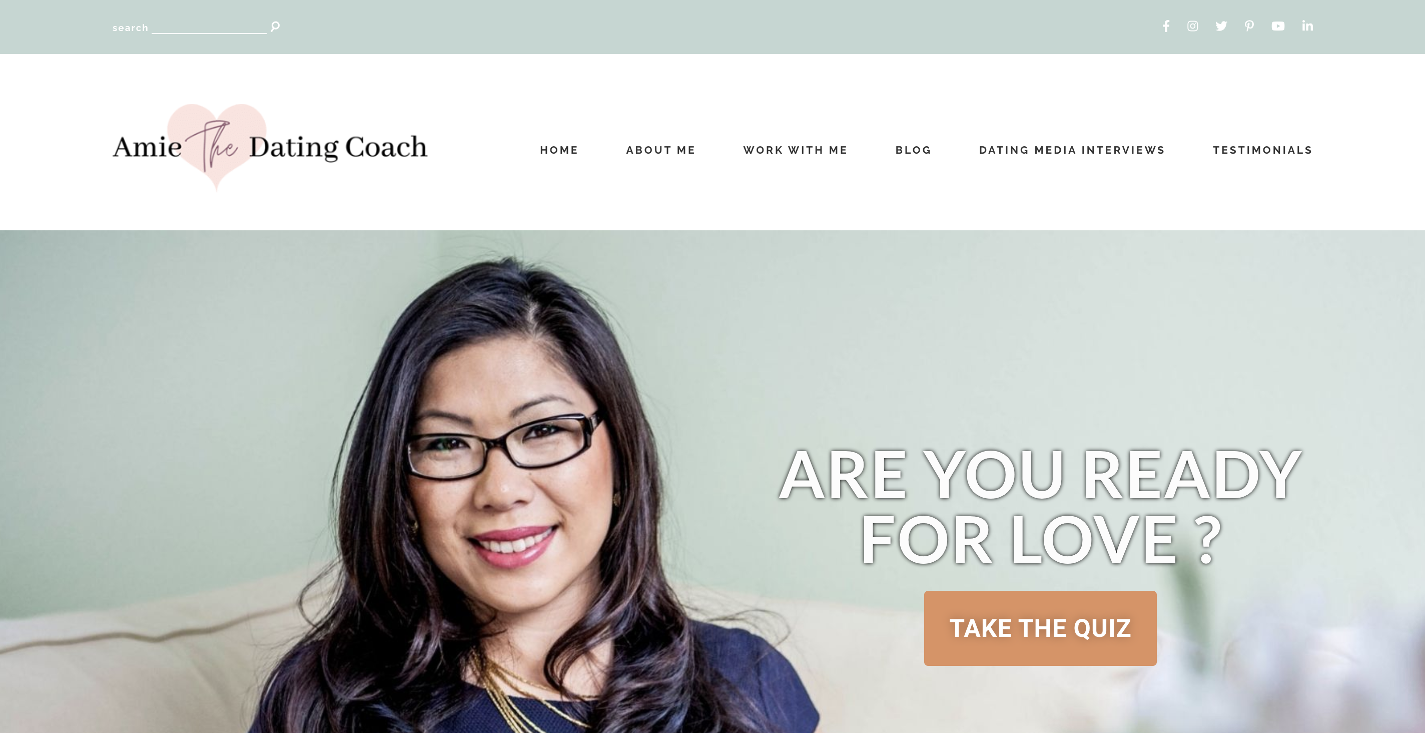
Amie Leadingham is a professional dating coach that will help you find peace with yourself and become able to find your perfect partner. She designed a method of Conscious dating and promoted it via her online coaching website.
The website opens with a quiz to evaluate the reader’s readiness for a serious, long-lasting relationship.
It is important to note that her website is done in a pastel color palette with dominant pink – those colors are associated with romance and love.
What can we learn from Amie Leadingham?
- Put quizzes on your website’s main page. People like taking quizzes and discovering themselves.
- Use symbols so readers would subconsciously connect one to another, like the excess of pink as a symbol of love.
3. Jivenny Blair-West
Jivenny Blair-West is a dating & relationship coach who offers programs for both men and women. She is the co-author of the book “How to Make the Biggest Decision of Your Life”.
She presents the stages of how she can help the client achieve their goals. True-to-life & relatable situations make potential clients better understand if they need dating coaching services. If you want to know more about what & how she does, a short interview snippet may help.
Key takeaways:
- She has separate quizzes for men & women, which makes her services even more customized.
- There is a special section for media where Jivenny presents her podcasts.
- The colors & design perfectly match the website's purpose.
Leadership Coaching Websites
We are almost there! These examples of leadership coaching websites will be helpful to you.
1. Strategic Leadership
Ken Whitters created a website for coaches based in Australia, and since 2004, he and his team have been promoting their services to help people with strategic leadership. They work with individuals, teams and organizations and provide consultations, education, and coaching for them.
Key takeaways:
- Team members and their individual contributions help to build trust between life coaches and customers.
- Concentrate on a particular audience, and be more specific to become effective.
2. Press Start Leadership
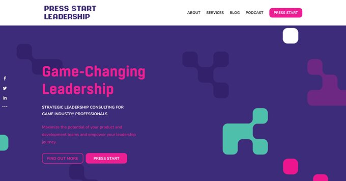
Press Start Leadership is an online coaching website for game industry workers to develop leadership skills. It was created by Christopher Mifsud. His platform aims to develop leadership and strategic skills in video game industry leaders without wasting much time or money.
The website is notorious for having a video game ambiance, with terms specific to games, references to popular media, and occasional witts.
Key takeaways:
- Be fun! Engage your visitors, and make coaching look like a fun game.
- Show yourself and your experience. It helps with trust.
- Be humorous. It’s a breath
- of fresh air for your customers.
3. Joshua Miller
Joshua Miller is a best-selling author and an executive coach with an experience as Creative Lead. His website stands out with a compelling banner and header text.
The color combination of black, red, and white help the visitor to distribute attention to the most important things. His appearance in the media and the clients he works are also uniquely represented on the homepage.
Key takeaways:
- His posture and confident smile speak of his professionalism
- He included case studies and testimonials on his website
- The website has a wisely-planned structure and navigation menu.
Executive Coaching Websites
And finally, executive coaching! Let’s look at examples we’ve got for this niche.
1. Kimberley Sherwood’s
Kimberley Sherwood’s life coaching platform is dedicated to helping non-profit organizations with building a clear path, focusing on fundraising, strategic planning, and governance. She offers coaching, consulting and facilitating, helping non-profit organizations when they’re ‘stuck’.
Her website is built strategically, offering doses of information as the reader scrolls down. She describes how coaching, consulting and facilitating help her consumers, and puts a free guide below as an example.
Key takeaways:
- Carefully portion your information and spread it through your website, giving your readers breaks to prevent fatigue.
- Put a case study example of how your activity helped achieve the goals that you set.
- Build a friendly atmosphere with the design and content to attract customers.
2. Antoinette Dale Henderson
Antoinette Dale Henderson is a notorious woman, most famous for being an executive coach, TEDx speaker and writer. Via her coaching website, she aims to power up people, for that to fulfill their potential and follow their ambitions.
Her website is built around the color red which shows her confidence and dedication. Here and there Henderson shows that her programs work, whether by noting her 25 years of experience or showing the magazines where she is featured.
Key takeaways:
- Show that you are confident in your skills, make people trust you, but be down-to-earth – readers should sympathize with you.
- Use your website design in connection with your persona and your work.

3.Sea Change
Elaine Morris is the one who owns Sea Change, Inc. She is an experienced executive coach and facilitator who works using a holistic approach. She also has experience in various industries.
By just scanning the homepage, you can get an idea about who the company has worked with and find the answers to the most frequently asked questions.
Key takeaways:
- The company has a website structure that is clear and not complicated.
- The company runs a successful and helpful blog.
So, remember to keep every element on the website simple yet effective.
Create your coaching website now
There are hundreds of other websites you can take inspiration from to build your own. And while you are having second thoughts about whether you really need a website now or not, others take definite steps toward improving their coaching websites.
And how do I create my website when I have got not so many tech skills? Isn’t that time-taking?
Well, this process becomes much easier when you join Uteach.
With Uteach, you can have your coaching website set up within a few minutes. It comes with various customizable templates so that you can choose a design that fits your niche best. You can add your branding elements and send branded emails to establish your brand identity. Powerful marketing and coaching session-planning tools are just the beginning of the journey!
Discover the full features of Uteach now and give your website that professional and trendy look.


![How to Start Online Coaching Business [Proven Strategies]](https://d35v9chtr4gec.cloudfront.net/uteach/articles/LXoil0HbCqKEO2lAdpzG-1693384984/start-online-coaching-business.jpg)