Visual teaching is the best way to pass messages for learning purposes. However, there is an argument that using technical devices for education will interrupt students' thinking and creative capacity.
These arguments are common in educational debates. On the other hand, delivering an idea with demonstrations has an immense impact on recalling and understanding a topic. So here comes the importance of engaging educational PowerPoint templates.
The following article covers:
Why create an educational PowerPoint presentation?
Why create an educational PowerPoint presentation?
Educational PowerPoint presentation will pass information to the audience with eye-catching visuals. So, it is both informative and introductory.
It aims to familiarize the viewers with the topic. The viewers include students, business executives, researchers, and others seeking information.
PowerPoint is an effective tool for presenting study materials. Hence, it will help in the classroom and strengthen students' learning capacities. The educators may use supporting visuals like images, graphs, data-driven charts, and tables to pass an idea. Such visuals will help the viewer to get the idea effortlessly.
Making educational PowerPoint presentations
Let's look at the main steps it takes to create an engaging educational PowerPoint presentation. You can use Google Slides, Keynotes, or any other presentation software to create one.
#1 Define the objectives
First, you have to set a learning goal. It refers to what your audience will know after seeing your presentation.
The objectives of the presentation may differ according to the type of presentation. The types include
- Decision driven. This type of presentation is used when you need to achieve a common goal, so you need a presentation guide to help everyone in decision-making.
- Persuasive. These are mainly used when giving a business pitch or making a sales offer.
- Informative. As you can guess from the name, these presentations are mainly used to share knowledge or information.
- Introductory.
You can set your objectives according to the type. Each of these types comprises different desired outcomes.
#2 Focus on the target audience and accessibility
For the presentation to achieve its purpose, you should know the strengths, weaknesses & needs of your target audience.
For example, learners with visual or hearing impairments could not be able to access a PowerPoint presentation. They need help to go through images, sound, and graphics. Besides, you must consider the audience's age, language skills, and ability to interpret a concept.
#3 Define what you want from an education PowerPoint presentation
The purpose of learning should explain clearly and concisely. For example, what specific skills should a learner have to display, produce, and know as a result of the PowerPoint class? So, you make sure that outcomes should be attainable.
#4 Plan your content
After you determine your content, you should select the best format. You can create this format as table content, a data chart, a comparison diagram, a circular diagram, or a timeline template.
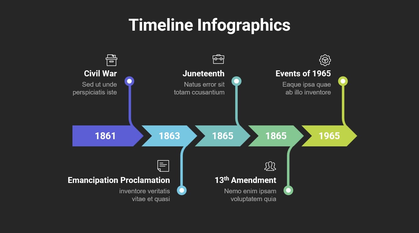
For example, if you think of lecturing about key milestones of American Slavery prohibitions, your format should be a timeline PowerPoint. Below you can see a simple timeline template for American slavery prohibitions.
- Civil war
- Emancipation Proclamation
- Importance of 1965
- Thirteenth Amendment to the United States Constitution
- Juneteenth

Source: Slidebazaar
This timeline would help you to create a sequential flow for your presentation. Then, if your topic is different, you can prepare another format. So, structuring a presentation is so important to hold your audience.
The sequence should be simple and logical, allowing the viewer to keep up with them and take away key points. It also determines how much interaction you want from the audience.
One more thing to remember when planning your content is the length of your speech.
#5 Design the Slides
Designing and arranging slides in a flow will give the necessary support for your PowerPoint presentation. Let’s see what you should and should not include in the slides.
Decide on the numbers of Slides
- In the real sense, the number of slides depends on your subject and time. However, you can use 10 slides for a 20-minute presentation. That means one Slide for two minutes to account for discussion to absorb the material. (If your lecture is under two minutes per Slide, you can add more slides for a 20-minute presentation.)
Arrange slide contents
- Avoid too much text. Instead of long and heavy sentences, try to use brief points. Some of the best AI slides app options available these days can help you create one efficiently.
- Follow the 6 x 6 rule. You can incorporate a maximum of 6 bullets with 6 words per bullet.
- Use large fonts. Ensure your text is good enough to read. You can use a font size of 36-40 for the heading and titles, and the subtext should be around 32-point font.
- Avoid ornate fonts. Stick to basic fonts because specialty fonts may be difficult to read.
Make the content readable
- Use bold, italics, and attractive colors to mark key points.
- Use dark backgrounds (black, blue, purple, etc.). Use a light typeface or light background (white, light blue, yellow, etc.). Or use a dark typeface for easy reading in a large room.
- Apply only two or three color combinations per Slide. Otherwise, it will distract viewers' attention. However, in the case of statistical diagrams, you can add more colors. For example, if you are using a pie chart with 5 or 7 distributions, you can use more colors.
- Try to avoid underlines because it denotes hypertexts.
Add images clipart and graphics
- Use images and graphics only if they support the content. Too many uses of these will obstruct viewers' learning. Use pictures and clipart sparingly.
- If a photo is essential, use simple pictures without decorations.
- Choose only two-dimensional graphs and data-driven charts. Avoid 3D styles since it obstructs reading accurate data.
- Place graphics appropriately, having accurate dimensions.
Use animations carefully
Animations are catchy motion pictures. But they only give desired outcomes if you add them to your slides sensibly. For primary schools, animations may be essential to tell a story. But avoid using them for each Slide. Instead, you can add it for business presentations when you need a transition.
Avoid many ideas on one slide
Cramming information into a single slide will overwhelm your audience. The learners may seem disinterested, so they will stop listening to you.
Instead, only focus on one topic in a slide. It lets you cut off your speech about that material according to your scheduled time.
Pay attention to slide arrangement
Flow and sequence is the soul of any presentation. So, to keep the audience's attention on the topic, follow the below order of slide arrangement. Use high-quality yet simple templates with relevant images. A common sequence may be the following:
- Heading Slide
- Attention-grabber Slide to make the audience interested in the speech and topic.
- Topic preview
- Content
- Transition
- Content
- Conclusion
- Q&A
#6 Make the presentation interactive
Sometimes digital platforms have communication barriers. You can't easily understand students' body language and facial expressions. This is the reason you should come up with ways to keep the presentation interactive.
Encourage participation from the beginning
Use separate PowerPoint slides before you start the core presentation. These slides should include a series of questions for students to answer while waiting for class to begin. You can arrange it in a quiz format.
In the final session, consider having a question-and-answer session that includes a quiz about the topic you have covered. This session will provide an opportunity to receive feedback. You can also use QR codes to increase audience participation. QR Codes are a quick and engaging way to make your quiz more accessible, collecting feedback post the presentation, or encouraging email sign-ups.
Use quizzes polls and surveys
Most of the teachers need clarification on where to include polls, quizzes, and surveys. Is it at the beginning, middle, or end? What we have in the beginning is what we already discussed. You can add surveys, polls, and quizzes from the middle to the end without losing the sequence and fluency. For example, if you are on the topic of climate change, you can take a class opinion poll where the student stands on climate change issues.
#7 Practice and delivery
Don’t read the presentation. Rehearse the presentation with a sequential flow so that you can speak from bullet points. The text should be a hint for the presenter rather than a complete message for the students.
Succinctly prepare and control over descriptions. A presenter may already schedule their time allocations, so overly explaining causes stop your presentation halfway. Look at your watch when staring at each slide and control the presentation according to the prescribed time limit.
Focus on audience. Monitor your viewers body language and behavior rather than focusing on your slides.
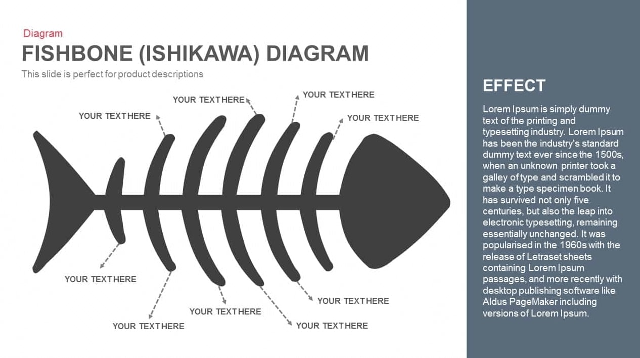
Use proper designs and diagrams. Many designs and charts are already incorporated into PowerPoint presentations. For example, if you want to display the cause-and-effect relationship between two or more items. You can use simple arrow connections or drawings showing the relationship. But if you want a professional touch, you can use a fishbone diagram to show the cause-and-effect relationship.

Source: Slidebazaar
A few more tips for delivery
- Use microphones
- Choose clear and simple fonts
- Select high-contrast colors
- Include multiple-choice questions
- Use video files if necessary
Conclusion
In this article, we have covered how easy it can be to create a presentation to educate learners with PowerPoint templates. The ways of using interactive components will determine their learning effectiveness. It will also make for more satisfied audiences, regardless of your subject.
A presentation with visual aids enables the audience to understand the topic easily. It not only engages your audience but also helps the audience to recall the subject that you have discussed.
If you are a provider of online education courses, you can use Uteach to create a course website within minutes. Besides, Uteach provides handy tools for coaching businesses that help you build end-to-end live sessions. So, if you want an online, scalable coaching business, then Uteach is the right choice for you.


![How to Start Online Coaching Business [Proven Strategies]](https://d35v9chtr4gec.cloudfront.net/uteach/articles/LXoil0HbCqKEO2lAdpzG-1693384984/start-online-coaching-business.jpg)
