
The following guide covers:
Pop-up ideas for conversion and engagement
Key considerations when using pop-ups
How to create pop-ups with Uteach
Did you picture that “annoying window” that covers your screen and makes you click away, while you desperately try to browse the necessary information on a page? Forget that, because in this article, we are going to cover the key practices and ways, so your students find value, instead of getting annoyed.
In fact, pop-ups are smart tools to guide your visitors, boost enrollments, and re-engage students. Let’s discuss how you can make the best use of pop-up marketing based on the best practices from successful creators. And also, we will discuss how NOT to create pop-ups for you to avoid common mistakes.
Are pop-ups still effective?
Yes, pop-ups are NOT an outdated way to get leads and engage site visitors. Recent research shows that pop-ups convert, on average, more than 4.65 % of website visitors. So, let’s say your website gets 1000 visitors. If we do the math, that would be approximately 46 leads. And that is just from this one channel. Not bad for a small piece of your funnel, if you ask me.
Optimonk also did research using its internal data, finding out that well-optimized pop-ups can hit 11.09 % average conversion, and the top performers achieved up to 42.35 %.
Let’s not forget that pop-ups are still one of the easiest ways to get new leads because:
- They do not take much to set up.
- They do not require a heavy cost or massive traffic.
- What matters most is a strong offer and the right trigger.
But for them to be effective and impactful, you should use them thoughtfully.
Pop-up ideas for conversion and engagement
Before you jump into setting up the pop-ups, have a clear goal in mind. For example, the goal of your pop-up campaign might be
- Get new leads
- Convert visitors who visited your website previously
- Build a list of email subscribers
- Increase engagement in your courses and programs, etc.
Just a small heads up before we get into details!
Your pop-up will only work if it matches where your visitors are in their awareness journey. Those are
- Unaware, so you should educate them first.
- Problem-aware, so you need to solve a pain point.
- Solution-aware, meaning you can share the course-related offers for lead generation.
- Your solution-aware visitors already know about your courses, so you want them to take an action already.
Add if you were worrying about writing the pop-up copy this whole time, deciding on a specific segment, and the page makes creating the copy way easier.
For example, imagine you run a photography school. A blog reader who is browsing your article pages, or webinar pages, is surely problem-aware. Yes, they are not ready to buy, but they are interested in learning. Meaning you can offer them a guide or a mini-lesson that speaks directly to the problem they were researching on your page.
No need to get confused, though. Let’s discuss each of the cases and see examples, so this makes sense to you.
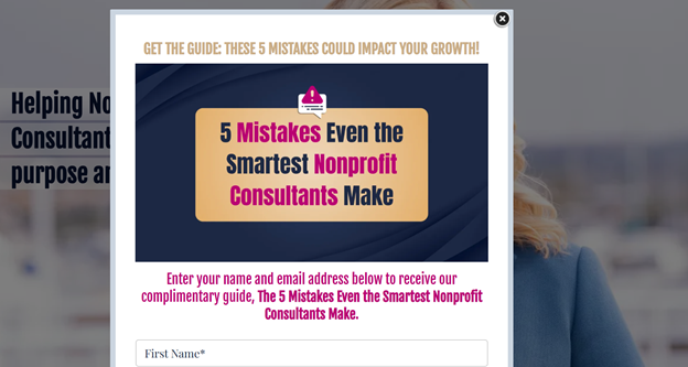
Lead generation pop-ups
Lead generation pop-ups help you turn visitors into potential students before they leave your website. They collect emails to use in email marketing, build relationships, and start the conversation that can later lead to enrollment.
Depending on which page you create the pop-up, you can do the following.
Page Type | Visitor awareness | What could be helpful | Your offer |
Blog articles, webinars | Problem aware | Free resources, practical tips, or quick wins | Offer a mini-course, checklist, or free lesson related to the topic they are reading about |
Specific course page | Solution-aware and your solution aware | Proof, details, or bonuses, even down-sell offers | Offer a course preview, demo class, a webinar, or a live event. |
Homepage | Awareness varies | Exploring your brand | Offer a general resource, such as “Get the Ultimate Course Starter Guide” or “Join Our Community and Get a Free Lesson” |
How to trigger these types of pop-ups?
Of course, these are just recommendations, and too much depends on your content and page. Yet, you can bear the following in mind.
Trigger type: | Scroll-based (when the visitor reaches 30% of the page) |
Suggested formats: | Slide-ins, light-box, delayed |
CTA examples: | “Get My Free Lesson”, “Download the Checklist”, “Join the Free Workshop” |
Our tip | Personalize your headline to the page content. |
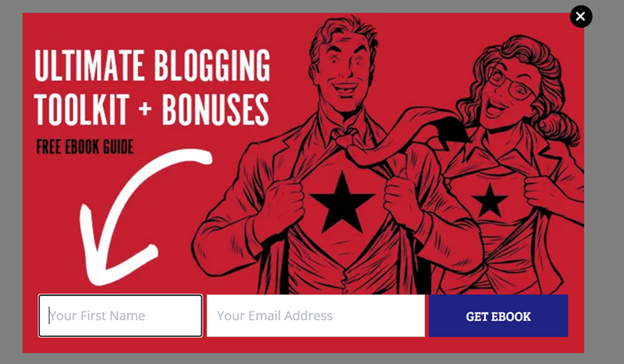
Here is an example of a lead-generation pop-up I found while looking for ways to engage readers in blogging. It offers a free e-book guide on blogging in general, with a very simple CTA.
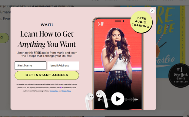
Similarly, Marie Forleo offers an audio training for free, placing the pop-up with an exit intent.
Enrollment and conversion pop-ups
If you project the idea of buying something on yourself, you will see that most of the time, we are interested in buying. Yet, all we need is a little convincing. These would be for all your learners who browse your course page, check the price, and then leave “to think about it.”
Because, like Jessica Terzakis shared in an interview with me, nowadays learners are more selective about what courses they spend their money on. So, you want to give them a reason to make a decision on your behalf.
“This whole idea of courses was such a new thing pre-COVID for a lot of people that they would say yes to buying just about any course that they found you. Fast forward to now, our clients and customers have much higher expectations for what they're going to invest their money in. They've been through courses that have not been that great, and so they're a little bit more thoughtful and cautious with where they're spending their money in their time and who they're buying a course from.”
Jessica Terzakis
Co-Founder at Terzakis & Associates
Your goal is to have a well-timed conversion pop-up that can turn that hesitation into action by adding urgency, exclusivity, or a meaningful bonus.
The effectiveness of these pop-ups depends on how well you understand your visitors’ awareness stage and where they are in their decision process.
Page Type | Visitor awareness | What they look for | Offer ideas |
| Course page | Solution aware or your solution aware | Clarity, social proof, last push to decide | “Enroll Now, Get Bonus Resources” or “Limited Spots in This Cohort” |
| Checkout Page | Your solution aware | Reassurance or reason to complete payment. | “Enroll Now, Get Bonus Resources as you Enroll Now” or “Flash Sale: 30% Off Ends in X Hours” |
| Homepage | Solution aware | Overall credibility and a reason to join | “Course Launch Countdown” or “Early Access Discount” |
And when it comes to the ways of triggering, you want to meet your learners at the exact moment when they are considering your offer.
Trigger type: | Exit-intent (when the cursor moves toward closing the tab) or time-delayed. |
Suggested formats: | Standard pop-up or full-screen message |
CTA examples: | “Enroll Now and Save 30%”, “Secure Your Spot Today” |
Our tip: | Add urgency only when it is real. If the offer is time-sensitive, show an actual countdown. If the cohort has limited spots, mention the number. |
Re-engagement pop-ups
Re-engagement pop-ups are for your existing students who have not been actively learning and engaging with your training and courses. The goal is to bring them back on track.
So, you can create a context where the students get their progress, achievements, or next steps waiting for them. Here is how you can structure these pop-ups based on where they appear:
Page | Visitor awareness | Goal | Your offer |
Student dashboard | Already enrolled | Progress reminder, motivation | “Resume Your Learning” Pop-up |
Course portal or the lesson page | Already enrolled | Encouragement to complete a module or earn a certificate | “Your Certificate Awaits” Pop-up |
Community or group page | Already enrolled | Connection and shared learning | “Join the Study Community” Pop-up |
Re-engagement pop-ups work because they celebrate progress and remind students that learning is an ongoing process.
Community growth pop-ups
Students who already value your teaching are often willing to invite others, join advanced programs, or stay connected to your brand. And if you prompt them at the right time to do so, you will be able to drive engagement.
Page type | Visitor awareness | What they look for | Offer idea |
| Student dashboard | Already enrolled | Next learning opportunity, referral benefit | “Refer a Friend, Learn for Less” |
| Course completion page | Your solution aware | Continued learning, community access | “Join Our Masterclass Series” |
| Community or membership page | Solution aware | Exclusive perks and ongoing value | “Exclusive Access for Members Only” |
| Homepage or blog page | Unaware or problem aware | Inspiration or tips to stay connected |
“Join Our Newsletter and Get Weekly Learning Tips” |
In a nutshell, if you want to direct your community to a specific channel, pop-ups are great for that purpose. You can even give people an incentive to do so.
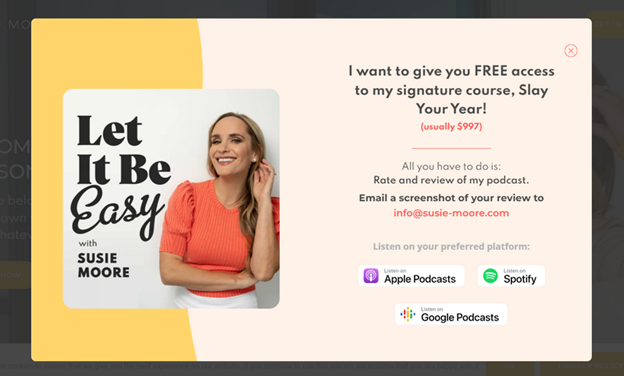
For example, at the moment of writing this article, Susie Moore set up a pop-up that directs visitors to rate and share feedback on her podcast. And in exchange for helping promote the podcast, she offers free access to one of her courses.
The key thing to have in mind when using the community engagement idea is that you have to offer a real value that your community cares about. Otherwise, what would be the point of the incentive, right?
Key considerations when using pop-ups
Have you already thought of any ideas for using pop-up marketing to promote your online school? Because we will discuss how you can make those ideas actually work!
- Think of a format that works best for the goal
The reason why we create the pop-ups in the first place is for any kind of conversion. To make sure that your pop-up is optimized, first think of the format. As a general practice, I would recommend
- Top or bottom bars to announce your course discounts, new course launches, or offers like webinar reminders.
- Full-screen pop-ups for big discounts or events. Though you should be more careful here. Most full-screen pop-ups I encountered feel somehow intrusive.
- Embedded pop-ups, also great when your offer directly relates to the information on the page.
- Slide-ins are better if your offer directly relates to the page they are browsing, where you can offer a bonus. And if you want to join your newsletter, slide-ins are better.
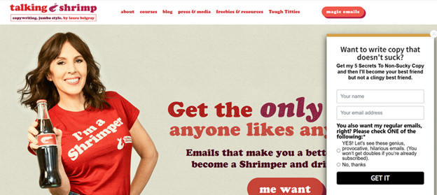
Here is an example from Laura Belgray. It is placed on her site with an exit intent and helps to get general leads. Slide-in is better in this case, since she needed to include additional information about her newsletter. This amount of copy would be too much for a regular pop-up and will require multiple steps.
- Time it right
When you think of it, there is one key reason you want to close an annoying pop-up. When you just land on the site, something immediately comes forward, and you do not manage to figure out what the page is about.
Not to be annoying, always make sure to:
- Set your pop-up to appear after 10–15 seconds or once they have scrolled through at least 30% of the page.
- Set a frequency so you do not show the same thing to the visitors who access your page often.
These numbers are not a rule of thumb, and you can change the timing as long as your offer feels helpful.
- Keep the message clear and focused
Another point that greatly annoys most people in pop-ups, and you want to avoid at any cost, is heavy text. As we have discussed at the beginning of this article, have one clear goal and build your message around it.
I have seen so many examples when people are trying to sound smart and fancy. One went like: Fuel Your Future with Elevated Experiences.
That way, you only confuse the visitors.
The best way is to write your message as clearly as you can. Then try to shorten it.
- Make CTAs action-oriented
Like the rest of your copy, the CTA should be clear, bold, and action-driven. You can use verbs like join, enroll, download, and get.
I recommend keeping one clear CTA and in no way trying to manipulate or trick your community. One example many think is genius is when you try to get them to click on your offer.
This seems more like a mockery, and no one likes looking foolish.
- Optimize for mobile
Mobile devices now account for roughly two-thirds of global web traffic. Meaning there is a high chance that your future students will see the pop-up window on their mobile device.
That is exactly why I shared to be careful with full-screen pop-ups that block everything. Make sure your buttons are easy to tap, and your text is readable. Also, test how your pop-ups appear on both Android and iOS devices.
- Consider the user experience
Keep the design clean, make it easy to close, and do not let it appear more than once per session.
Here is an example of what NOT to do from a business coach, Natalie Eckdahl's website. As you can see, it is too large for the page, and I had to scroll to see the whole offer or close it.
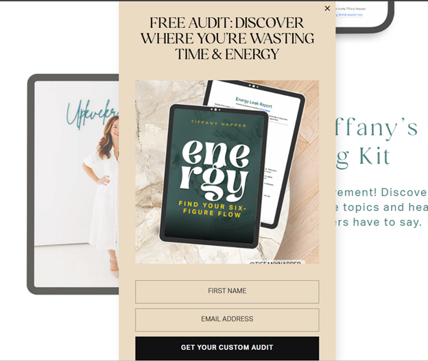
- Offer real value
If the value is clear, people will not mind the pop-up. In fact, they will look forward to what you offer next.
The example below is from Tiffany Napper’s website. We are used to seeing discounts, guides, and free courses all the time. These are valuable, do not get me wrong.
Yet a free audit is something unique and feels more personalized if you compare it with a guide on how not to waste your time and energy.
What I also like is that there is minimal copy and a clear message.
How to create pop-ups with Uteach
If your online school runs on Uteach, there is no need to use external pop-up builders, unless you want to. It is simple, fast, and built right into your admin dashboard.
- Choose the format
Start from your dashboard and go to Website → Popups.
Here, you can click Create New Popup and pick one of the ready-to-use templates.
- Image on top, button below for a short promotional message
- Image with description under it, if you want to explain your offer a little more.
- Image on the left, text on the right for a professional, ad-like style.
Choose the layout that best fits your goal. If you are promoting a course, keep it visual and to the point. If it is a newsletter offer, you can give it more text space to explain the value.
- Add your elements based on the template
Add a short, catchy title, upload an image that fits your message, and write a brief description based on the practices and examples we discussed above.
- Set timing and visibility
Next, decide where and when your pop-up will appear. You can make it visible on your website, mobile app, or both. As for frequency, you can choose among the following options:
- On First Visit – for new visitors.
- On Every Visit – for your limited-time offers.
- Once Per Day, if you do not want to appear too pushy.
You can then set a delay time (for example, 50 seconds) before the pop-up appears, so it does not interrupt your visitor right away.
- Preview, publish, and track
You can monitor the performance of each pop-up right from your dashboard.
Uteach gives you clear insights, such as:
- How many people saw your pop-up
- How many clicked the button
- How many closed it without taking action
- Who interacted with it the most
Pop-ups are smart tools to guide your visitors, boost enrollments, and re-engage students. Book your free demo with our expert to learn more about how you can use pop-up marketing and sell your courses on Uteach.