Whether you are an experienced creator or a beginner, sales are vital to further grow your business. Thus, it is vital to be aware of new methods and ways to increase conversions.
We welcome you to the ultimate guide to creating successful online course sales pages. Follow the simple tips from this article and skyrocket sales with a properly built sales page.
The following article covers:
Write these down before creating a sales page
What is a sales page?
First and foremost, let’s understand what a sales page is.
A sales page is a page designed to trigger an action. (e.g., make a purchase or sign up for X)
The primary focus of such a page is to showcase the product/service in the best possible sight with a compelling description. The target goal is to turn visitors into customers.
How does it differ from the landing page?
Many may confuse the sales page with the landing page. The main difference between them is purpose.
A landing page is a wholesome page designed to support a particular marketing campaign. The main goal of a landing page is to capture leads by collecting user information. This information typically includes name, email address, and other contact details.
On the other hand, a sales page has the purpose of increasing sales. It focuses on the display of a product/service in a persuasive manner. The sales page also aims to speed up the decision-making process and overcome any potential objections that stop the customers from making a purchase. So, the end result should be conversion.
Write these down before creating a sales page
If you want a sales page that truly drives results, you must be well aware of several aspects. Below are the top three questions to know the answers to before creating a sales page.
Who is your customer?
Understanding who your customer is is the first step to success. Let’s review the scenario where you do not know who your clients are. How are you going to offer them solutions to their problems? It would be impossible.
So, here are the Top Tips on how to identify your customers.
- Conduct proper market research. (surveys, focus groups, competitor analysis, data collection & evaluation)
- Define your value proposition. When you know your value, it becomes easier to understand to what segment of the market it will be most appealing to.
- Segment your target into smaller groups for more efficient further marketing efforts. This process is about creating buyer personas.
Let’s dive a bit more into detail about the buyer persona. You can create a value proposition canvas when you know who you are targeting. This is a technique that allows you to position your product in a way that is appealing to the potential buyer.
What do you offer to solve customers' problems?
“The more accurately you can describe your reader’s problem in terms they can relate to, the more they instinctively feel that you must have an answer to that problem.” – Jay Abraham (business executive coach)
You can create a Value Proposition Canvas to understand how you solve customers’ problems. It is especially efficient when you know who you are targeting. This technique allows you to position your product in an appealing way to the potential buyer.
Essentially, you just have to fill out the fields below based on your product.
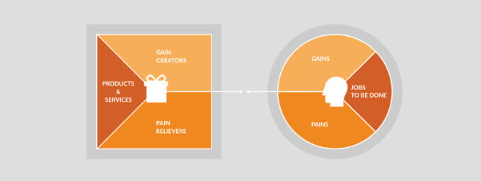
As you can see, Canvas consists of two main profiles: customer profile & value map.
Customer Profile:
- Gains. Positive outcomes, goals customers seek
- Pains. Problems and challenges customers face
- Jobs to be done. Tasks/problems customers are trying to address.
Value Map:
- Products and services you offer that provide solutions to their problems
- Pain relievers. Features/benefits of your product/service that relieve customer’s pain
- Gain Creators. What are the positive outcomes and benefits created for the customer from your offering?
Let’s say our target buyers are people who want to start a business. We offer a course on entrepreneurship. But so do many others. After creating our value proposition canvas, we are clearer on what sets us apart. Thus, we gain a competitive advantage and are able to market our course better.
What value can you give your customers that no one gives?
Also, what makes you stand out among the rest? Why would customers choose your product over the product of your competitor?
You need to identify key points that make your online course stand out. So, find unique selling propositions for your course. Easier said than done, right? Well, that might be true. But here are a few tips for you to help you understand what value you give to your customers that others do not.
10 components to create a GREAT sales page
As far as we are clear on the audience, problems, and solutions, let’s move on to the process.
Structure is key
First of all, keep in mind that structure is your key to success. Your sales page must be well structured in order to work.
#1 Headline
The headline must be catchy. Most of the visitors will leave your sales page after reading the headline. Or, they can stay and keep reading. Which one of these two options occurs depends on your headline.
A great headline must grab attention, communicate the benefit/solution, and spark curiosity. It also should be short and to the point. Let’s review a few practical examples.
Example:
Both these headlines feature similar characteristics that make them successful.

The first headline states the main topic of the course “Marketing Analytics,” uses the catchy word “Mastery,” then states the course content’s focus “from strategy to application.”

The second headline also clarifies the topic: “Complete Digital Marketing Course.” And specifies it further with “12 courses in 1”. The second part clarifies the value students will get (multiple courses).
How to do:
Follow these tips to create headlines that work:
- Use simple language. Do not go overboard with highly technical terminology.
- Clarify the main topic from the beginning. Make sure the first part of the headline communicates the focus of the course.
- State the benefit/solution/value you offer. This will allow you to motivate purchase behavior.
- State what will be discussed during the course.
#2 Course description
Another vital part of your sales page dedicated to your course is the course description itself. Your course description must communicate the value it offers. It also should make the learning outcomes and gains of students clear.
Let’s review an example of a good course description and understand how to write one.
Example:
Machine Learning with Python course.

First, it clearly states the headline and has a tagline that explains what the course is about. Also, with icons, it states the duration of the course and the fact that it is self-paced.
Down below, there is a longer description.

The description is long enough to grab attention and communicate the value of the course. However, it should be short enough not to lose the reader’s interest.
How to do:
The course description must address the needs of your target audience. So, how can you write a copy that does? Here are the steps:
- Add a course tagline. Essentially it is the first sentence of the description, which is visible right after the headline before the “show more” hyperlink. Within the first sentence, clearly and concisely communicate the main topic and benefit.
- Make sure to include the benefits of the course. You can enumerate them in the format of bullet points as learning outcomes.
- Describe the format of the course to make it clear to the audience. (e.g., video lectures, live lectures, interactive assignments, etc.)
- Use engaging language that resonates with your audience. Use action verbs, words that make it personal, and compelling adjectives. (e.g., you, gain, transformative, from zero to hero, etc.)
You can also add a downloadable PDF with the course syllabus. Just keep in mind that the course description must answer the questions: What? Why? And How?
#3 What will students get?
Do not forget to mention what students will gain from the course. Everyone wants to understand what their return on investment is.
You can feature 3-5 main benefits of the course with icons on the sales page.
Example:
A good example is the one presented below.

As you can see, the instructor stated the benefits (learning outcomes of the course) in a clear and concise manner. It grabs more attention than a bullet list and is easier to read. So besides the text description bullet list, create a section with benefits that looks approximately like this.
How to do:
- Gather information and identify key benefits of your course.
- Craft engaging headlines for the benefits (make sure they are not too long). You can explain benefits in the course description section, but in the visual section, just state them shortly.
- Choose icons to use in front of each benefit. You can choose more visually appealing icons than in the example.
#4 Visuals / Videos
Make sure your sales page displays stunning visuals and videos. Did you know that videos on sales/landing pages increase conversion rates by 86%?
Example:
Here are a few good examples of visuals on sales pages. Let’s review Jenna Kutcher’s sales page for the “Instagram Lab” course.

The page starts with a short introduction and a call to action while showcasing Jenna in a cozy apartment.
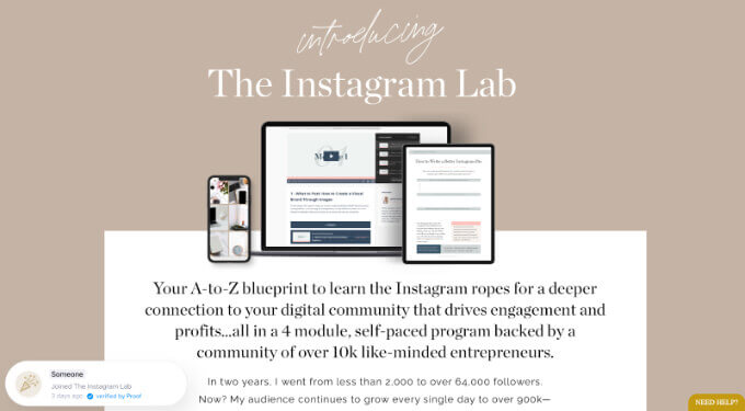
First of all, she sticks to her website’s branding colors. She uses a minimalistic approach yet displays enough catchy visuals. The sales page loads fast looks neat, and is easily readable.
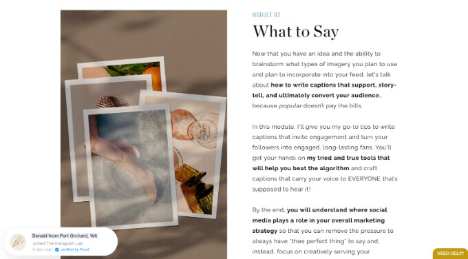
Sticking to a few simple rules, Jenna created a website with harmonized visuals appealing to the visitors.
How to do:
Here are a few tips for you related to visuals and videos on the sale page.
- Use eye-catching visuals. However, make sure that style-wise and color-wise, they go well with your overall branding guidelines.
- Leave enough white spaces for a better user experience and easier navigation.
- Make sure videos are short and to the point,
- 1-2 videos are enough. E.g. one can be a quick introduction to the course and the other introduction to who you are (30 sec). More videos will simply slow down the loading speed of the page, as well as overload it with unnecessary information.
#5 Author bio
An author bio is vital. Your sales page is dedicated to the course. However, to create trust and credibility, ensure you introduce yourself properly. You can either make a quick introductory video or a few-sentence description of yourself.
Example:
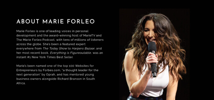
Here is how a good description must look.
In the example, you can see how Maria Forelo, trainer and online course creator, presents herself in the About Me section of the Copy Cure course’s sales page.
How to do:
Well, how can you write a good description? Follow these simple tips.
- State who you are and properly introduce yourself. Who are you? Where have you been featured?
- Establish authority and credibility. What awards, honors, or certifications do you have? Create buzz around yourself.
- Share relevant background information. Focus on information that showcases your expertise in the subject matter. (e.g., Marie is a famous creator, if you are just starting or do not have much fame, focus on niche information that will create credibility.)
- Add a few sentences on why you are passionate about the course topic. Emotion is what sells best.
Also, you can write about your overall teaching philosophy—for example, style, interaction, etc. This way, the students know what to expect.
#6 Testimonials
Display your past client testimonials or your certifications as proof of your expertise. It will help you to build trust and credibility.
Example:
A great example is Maria Forelo’s sales page for the Copy Cure course. The sales page displays testimonials toward the end that work as social proof.
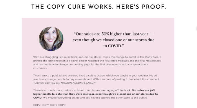
Another example of a detailed testimonial that serves as social proof.

The testimonials are displayed using “Catchy headlines” that instantly draw attention to the achieved results. Also, portraits of authors of these testimonials are featured, which creates more sense of credibility. Afterward, the review itself with longer-form text follows. So, the structure is on point, which is why these work.
How to do:
- Create a testimonials section toward the end of your sales page.
- Use the author’s photos if given permission to create more sense of credibility and social proof.
- Structure well. State the result students got as a headline before displaying the longer form of testimonial.
- Always ask for testimonials and follow up on your previous students.
- Display your certifications and degrees to showcase your expertise.
#7 Pricing
When someone is making a purchase decision, it is vital to see the price of the product right away. So, do not forget to include pricing. If you are a coach offering pricing plans by month or per session, make a pricing table and display it. If it is a training display price for the whole program. The same is true for online courses.
Example:
Jenna Kutcher’s sales page for the “Instagram Lab” course displays the pricing right on the top corner of the webpage. This is a great idea, as the pricing is clear from the beginning.

Also, a bit later, she displays all the pricing plans available for the course.
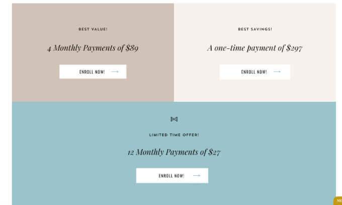
How to do:
- Place the pricing in a prominent and visible place.
- Structure the pricing. If you offer multiple pricing plans, then make sure to structure them properly.
- Clearly state the currency to avoid confusion. Many online creators simply use USD.
- Place the CTA button near pricing. For instance, in the example above in the top right corner, Jenna states not just the price of the course but also has a call to action “Click here: Get started today for just $27”.
#8 Money-back guarantee
When you give a money-back guarantee, students do not hesitate to make a quick purchase decision. Plus, most buyers won’t consider a refund as they will be interested in the course and its content.
Example:
Let’s also get back to one of the best examples of a sales page for Copy Cure course Marie follows all the rules, and that is why her course performs well. And in this case, she also states that she offers a refund toward the end of the sales page.

How to do:
Simply add a section toward the end of your website explaining to students that you offer a money-back guarantee. Make sure to use safe wording such as 100%, guarantee, refund, satisfaction, etc.
Using “safe words” is important to create an atmosphere of safety around your product. So, you are not aggressively selling, but you also guarantee that clients will be satisfied, and if this is not the case, they will get a refund. Thus, write a proper copy that will build the trust of users further.
#9 FAQ
Include an FAQ section related to the course. This will save you time on manual support as well as allow students with questions to get answers right away.
Example:
Marie showcases the FAQ section on the sales page of her course “Copy Cure.” The course is aimed at improving copywriting skills. She answers questions such as:
- I’m uncomfortable sounding “salesy.” Will these techniques make me look desperate?
- What if I don’t have thousands of website visitors or newsletter subscribers? Will I still see results?
- How much time will it take to go through the course?
- I’m so busy, and I’m such a slow writer! Should I just take this money and delegate it to a pro instead?
- Others.
She addresses all the main questions & potential concerns of her target audience. Also, provides thorough, detailed, yet to-the-point answers.
How to do:
A few tips on creating a good FAQ section for your course sales page include the following.
- Identify common questions and create a list
- Group questions by theme (if there are too many of them)
- Use simple language and make sure answers are readable
- Answer thoroughly to satisfy the reader instead of creating more questions
- Make sure your answers are relevant and to the point. Do not give an answer for Y when a person asks about X.
- Provide contact information.
#10 CTA buttons
Display CTA buttons throughout the sales page. CTA buttons can be of great help to motivate action and trigger purchase behavior.
Example:
On the Copy Cure course’s sales page, Marie displays prominent CTAs.

The first CTA is right at the beginning, and another one toward the end.
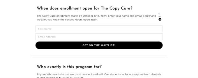
How to do:
How to create and place CTA buttons:
- Placement. Place one prominent CTA button right after the course description’s “read more” permalink. Make sure that the visitor does not have to scroll to see the button. Place other CTAs after key information, e.g., features/benefits listed with icons under the introductory video & description.
- Design. Use contrasting colors, making sure the button is visible. Also, ensure the text on the button is visible (use solid fonts & colors).
- Use phrases such as “Get Started,” “Enroll Now,” “Secure Your spot,” “Transform Your Skills,” and “Invest in Yourself.”
- Also, you can use phrases that convey urgency, personalize messages, or offer value. E.g., “Limited-Time Offer: Enroll Now," “Start Your Journey to Success,” and “Gain on-demand Skills)
Work with words
Playing with words is a great tip to help you on your journey. Content is a vital component of the website. Every page showcases several pieces of information. It is essential to write good copies for sales and landing pages.
Well, how can you do so? Play with words. Let’s review common, easy, and efficient words and why they work.
Well, how can you do so? Play with words. Let’s review common, easy, and efficient words and why they work.
- Result/s. Most of your students take courses to get certain results. So, using this word assures potential buyers that they will get a return on investment.
- Solution/s. This is another good word to use on your sales page copies, as it again serves as reassurance for the potential buyer.
- Limited. Using the word limited creates a feeling of missing out; if you are offering a discount, make sure to use this word in phrases such as limited-time offer.
- Uncover & Discovery. These words create intrigue and imply that your product/service will provide valuable insights clients can’t find anywhere else.
- Guaranteed. The word guaranteed once again creates a sense of safety and reassurance. It is a great word to use to increase trust.
Efficient and proven. Learners want to learn and grow thus, they must be sure that your methodology is efficient and proven to give results. So, use these words near the testimonials section of your sales page to increase credibility even further.
Sales page Don’ts
Also, you should avoid certain practices if you want your sales page to rank.
Being over-creative
Being over-creative will not help you. Indeed, you can get creative but keep it simple and to the point. At the end of the day, you want to communicate your professionalism and expertise.
Also, in the beginning, stages of your business, it is far more efficient to stick to proven practices that work.
Adding too much text
Going overboard with text won’t help you. Be precise and provide information potentially appealing to and motivating purchase decisions.
Adding too much text is about more than just keeping it short but also about not overloading a webpage with text. Leave enough white spaces (free spaces). This will allow your sales page to load faster, look more professional, and avoid confusion. So, visitors will actually pay attention to what is important.
Telling about you instead of them
Instead of going on and on about you, tell customers what they will gain. Give a description, e.g., if you are X, Y looking for X, Z, then this is for you. Ensure your visitors feel heard and seen when visiting your sales page. It a; ways should be about your customers and what they have to gain.
Of course, give information about yourself to establish trust and credibility. But, the overall focus should be on customers and their gains. They will be able to read more about you in the “about me” section of your website.
Speaking like robot
Do not speak like a robot. Add some emotion, communicate with the reader, ask questions, and keep them engaged. An emotionless text that aims just to sell will not work. In this dynamic industry, advertising is everywhere. So, make sure yours stands out and does not look like an ad.
Here are a few practical tips.
- Ask questions within the text.
- Use words such as You and We
- Focus on the solutions your product/service provides, not just its features.
- Place CTAs in all the right places.
Create your course sales page now!
The right time will never come if you keep waiting. Your right time is now, the moment you decide to take action. So, stop hesitation and start creating your online course sales page right now.
One of the platforms to look into as a course creator is Uteach. It is a potent tool and automation that allows for the successful management of online course business. Uteach offers features for sales & landing page creation, website & course building, marketing, and student management.
So, it is your time to build the perfect sales page for your online course. Get started now.
Uteach is with you all the way toward success.


![How to Start Online Coaching Business [Proven Strategies]](https://d35v9chtr4gec.cloudfront.net/uteach/articles/LXoil0HbCqKEO2lAdpzG-1693384984/start-online-coaching-business.jpg)
